STUDIO
A forward arrow, blowing in three lines.
BR Design system
Red voice. A forward arrow, blowing in three lines.
The system
VoceRossa literally means “Red Voice” in Italian. Red is a colour that strikes: it stands for blood, passion, fire and determination, and it inspired the studio’s name and its accent colour.
The logo began as an asterisk, a symbol that can stand in for any other glyph. Its final form is a forward arrow, for the future and innovation, blowing in three lines, for voice and communication. Here are its drafts, from pencil sketch to construction, and the final logo in its versions.
Ideal for Communication, marketing and copywriting studios; young, innovative brands.
Inspirations
- The asterisk, a symbol that can represent any glyph.
- A forward arrow: the future and innovation.
- Wide, impactful grotesques in the spirit of Horizon.
- A red and blue pair tuned away from the true complementary.
Drafts
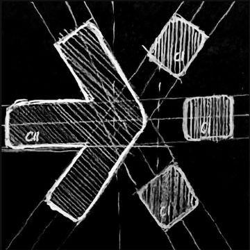

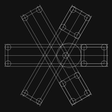

Final logo and versions
Brand identity console
Colour
Proportion of use
52%24%14%10%
Click a swatch to copy its hex code
Typography
Display
VOCEROSSA
Wide, impactful sans-serif (Horizon)
Shown here as Arial Black stretched to 130% width.
Text
We landed on its final form: a forward arrow.
Simple, linear geometric sans-serif (Mont)
Shown here as Montserrat, falling back to Avenir Next.
Contrast
- Aa18.4:1#FDFDFD / #121212AAA
- Aa8.4:1#00BAFF / #121212AAA
- Aa6.0:1#FF5757 / #121212AA
- Aa8.4:1#121212 / #00BAFFAAA
Motifs
- Forward arrow
- Three voices
- Logo