BRUTAL,but glamour.
02 / 09 Design system
Raw geometry, loud colour, pure impact.
The system
“BRUTAL, but glamour” is a design system that emphasises the basic elements — the fundamentals that make a design impactful and strong — without ever losing polish.
Heavy outlines, one voltage-blue field and one hot magenta. Everything is flat, cropped by its frame and unapologetic.
Ideal for Music and events, tech collectives, open-source and digital culture.
Inspirations
- Neo-brutalist web design and the early, unpolished internet.
- Swiss posters and condensed grotesque type.
- Risograph prints and rave flyers.
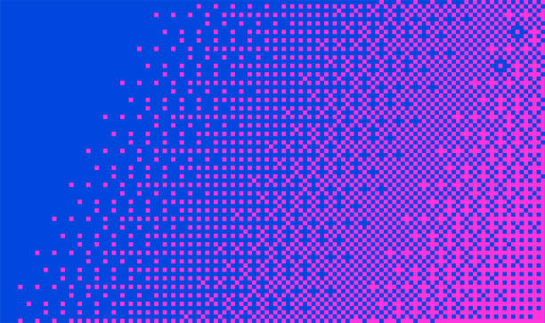
- Pixel dithering and halftone gradients.
Brand identity console
Colour
Proportion of use
78%20%2%
Click a swatch to copy its hex code
Typography
Display
BRUTAL
Condensed heavy grotesque, all caps
Arial Black squeezed to 60% width, tight leading.
Text
The quick brown fox jumped over the lazy dog.
Light rounded sans-serif
Avenir Next, falling back to Helvetica Neue and Arial.
Contrast
- Aa2.2:1#F634DE / #0146DFDecorative only
- Aa7.1:1#FFFFFF / #0146DFAAA
- Aa2.2:1#0146DF / #F634DEDecorative only
Motifs
- Outline frame
- Stacked diamonds
- Starburst